The cover design has been the toughest part of the book. Now that I'm a part of a book creation process, I feel that book cover design needs to be this tough. Its not easy to represent everything that the book is in one simple visual. It also needs to be attractive, yet aesthetics should not become the only focus. It has to be representative, but not too much.
Hemant Basankar of Bacteria Designs is the creative force behind the cover of Decoding Communications. A rare breed who is as good with the pencil as he is with the mouse. He sketches with passion and splurges colour and shapes with pixels.
The cover design of Decoding Communications is of much greater importance than any other book. Its because this book is meant to be "the book of everything in Communications – explaining what should be done, why
it should be done, and how it should be done." You falter in the cover design of a book with such a name, and it reflects.
All in all, the cover design came as too much of stress for me. At one point, I used to even see T-shirts that made me think of the my cover design. Here, I'm putting up 7 designs which we spent considerable time on (each representing a phase of the thought of which there were several designs), but those that did not not make the final cut. Each design began as excited scribbles, moving onto concept and finally taking shape in the designer's head, and then paper/screen.
The designs have to be seen like this. Each graphic is entire book cover with five parts, with front cover, spine, back cover and the front-inside and back-inside flaps. The first part (with my photograph) will eventually be folded and become become the inside flap of the back cover. The next section of the graphic is the back cover itself. The third thin strip is the spine of the book. The fourth part of the graphic (with the name of the book) is the actual cover, and the last part is the front-inside flap, which will also be eventually folded in.
DESIGNS THAT DID NOT MAKE IT


2. In the next selection shown here, the design clearly shows that
the book deals with 'human communications', and the human head leaves little for interpretation. Inside the head, Hemant visuals to represent symbolic ideas extracted the book. These add a creative and attractive appeal to the book. The cover background was maintained white to give high relief and keep the entire visual focus on the head.
You must not miss the spine, which just has a cut from what's in the head.
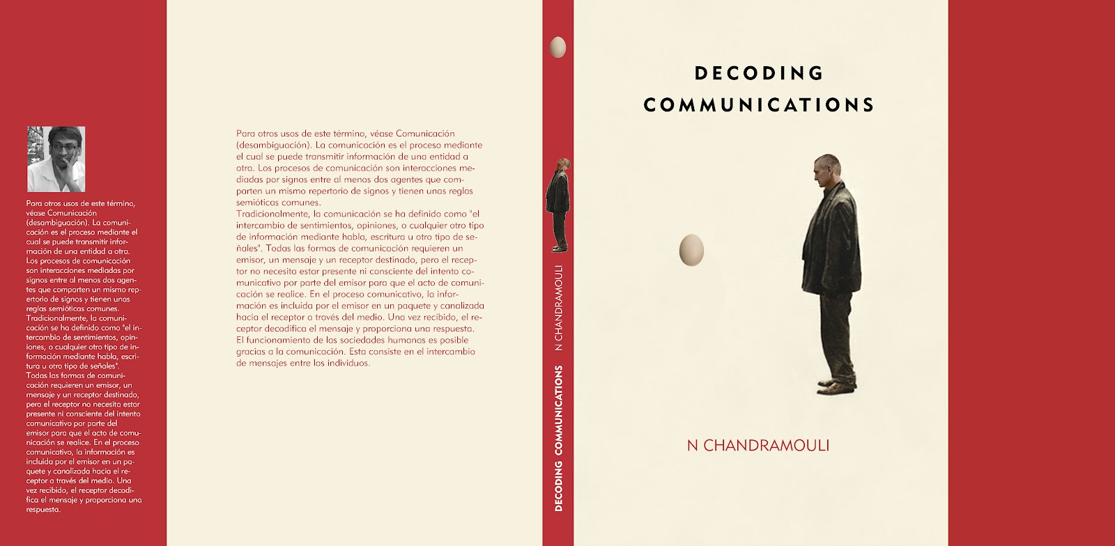 3. This design is more conceptual - and draws inspiration from the fact that Decoding Communications is about the magic of communications. We wanted a 'how-the-heck-does-that-trick-get-done' quotient. So, the floating egg in front of the man. No gesturing, no abracadabra. The man could be the reader, he could be the person performing the trick - the ambiguity is carefully constructed. I especially like the spine in this one. In an unusual turn from normal, there is a different image than that in the cover. The man is looking up, and he sees an egg on top of his head, almost as if it were going to fall any moment. This builds a sense of continuity and anticipation where the reader should probably say, "I wonder what happens next?"


After all these rejections, we finally narrowed in on a concept for the cover. It is entirely from Hemant's visioin, and this one is really tough to execute. But Hemant is taking up like an art project - so kudos to him. This one has hand sketching, calligraphy and visual appeal.
He's half through it. Will post the WIP soon.
No comments:
Post a Comment